It’s decided, the winners of the Xpozer Photo Contest ‘Animals’ are chosen. In total we had 944 submissions in this contest. They got a total of 3,490 votes. It’s a great accomplishment to win from all of these great photos. The winner, top 25 and personal feedback from the jury (Jasmijn) are below. Congrats to all winners and thank you all for joining the Xpozer Photo Contest.
Jasmijn (jury) about the winning photo:
This photo triggers my imagination. In my mind, the dog is either curious about what his master is doing, or it feels excluded and wants to be part of the family.
I see the dog’s character, there is a story in this photo and it makes me laugh, too. This photo completed the assignment best, I think.
Congrats, Wybrich Plomp!
Tips:
I would have upped the brightness in the right eye a bit. Or lighten the dark spots in that area. The nose is in focus, instead of the left eye. And last but not least, the door frame could have used a bit of a cleanup using Photoshop or Lightroom. But these are all just deatils. It’s a great image.
Check out Jasmijn’s feedback below in the top
Customers served!0
1. Beautiful dog! I like the blurry background and the dog is perfectly in focus. The overall image is beautiful. If you’re looking to make any improvements, you might want to make it straight and put the dog a little to the left (cut a part of the right side). Check out the ‘Rule of Thirds’. It’s a composition ‘rule’ that would work great here.

2. Such a touching photo. It looks like the dog was rescued by the woman. I would have loved to see more interaction between the dog and woman. The low-key background in the same color as the dog, works here. It also makes the tattoos stand out.

3. Beautiful colorful bird, the kingfisher, and a beautiful tranquil background. It’s beautifully framed. The eye is in focus. Nothing wrong with this photo. I just miss a story in it. And that was part of the brief. Other than that, great picture!

4. A great bow from this owl, to thank his audience. Cool pose! It’s a pretty photo, with light in the right places. The frame is quite wide, which leads your attention away from the owl. I would have loved to see the eyes, to really connect with the owl.

5. What a pretty dog and such a cute photo. It was focused on the nose, instead of the right eye, but in the end, it’s a nice photo to look at. The depth of field is a bit too small to my taste.

6. Beautiful colors and lines in this photo. The animal is not that clearly visible, which proves the camouflage colors work! Perfect placement of where the wall and ground come together in the bottom left corner. I love it. The subject is a bit too much in the center of the photo. Slice a little of the right side to make the composition stronger.

7. Great photo, great composition and great colors. The flowing line from left to right and the caterpillar is well-placed in the frame. I think it is a very strong photograph. Why it didn’t win? It doesn’t tick all the brief’s boxes. I miss the emotional connection to the animal and I miss a story.

8. Great contrasting colors, orange and green. Greens and reds are opposites and they strengthen each other. The chosen angle makes this a special image. I would have loved to see the animal’s head. That would have shown me its character, and it was part of the brief.

9. Such a pretty animal. The different shades of colors make it quite special. Being up close shows the beautiful colors even more. I would have loved to see more of the head. The grass is a distraction to me and I think the whites are a bit oversaturated. You can change that in post.

10. Such a great image. It looks like the painting of the old Dutch painters from the 17th century, because of the beautiful lighting. The photo inspires stories and there’s visible emotion in the face. The only point of improvement I can think of is that I would show more of the tail by making it brighter. And the light that comes from the door in the background should be a bit less bright.

11. I love squirrels! It looks so curious. I would make the tree a bit darker. And the background takes the attention away from the squirrel. You could remove some highlights and decrease the saturation in the background.

12. Such a cute nose. And it’s so cool to see the skin and hairs from this close up. It’s a very small detail, which makes it difficult to find an emotion or a story. But I still like it and it’s definitely original.

13. Wow, such a pretty photo and an amazingly beautiful horse. I see lots of emotions in the photo, but mostly of the girls. They look a bit scared of the horse. I would have preferred to see happier faces.

14. Cool! This tiger looks happy to be in the water. A nice cool-off on a hot summer day, that’s the story I make of it. I would have loved to see the focus on the eyes, which is so important in animal photography.

15. LOL, it looks as if this damselfly is sticking out its tongue. I have never been made fun of by a damselfly before, and I like it! The focus is just right and the colors are amazing. It’s truly a beautiful photo. Maybe you could try focus stacking someday. I would have cut a bit off the left, to make the empty space on the sides even.

16. They’re having so much fun! This is such a happy photo. Next time, you could use a bigger lens opening (try F4) to make sure the background is blurred out. That makes the animals stand out. Slice a piece of the wall in the background to get a clearer subject.

17. Ooooohh I love these two ground squirrels. They look like they like each other. The busy foreground leads the attention away from the animals. You could slice it out and make it a bit darker. Try to lead the animals away from backgrounds that don’t work for your photo. Put down some leafs, for example, and lure them towards them.

18. This makes me happy! I love the interaction between the flamingos. Well done. I like the composition, with the bird’s bum on the right side. The focus isn’t in the right place, unfortunately. Choose the focus point in the camera. Choose the smallest AF point in this particular situation, and make sure it’s on the eye.

19. Beautiful photo of a lonely buck. It looks a bit sad as if he’s wondering what life has to offer him. Emotion, check! Story, check! I love the natural frame around the subject. I do think the focus point is not exactly right. The animal should be in focus. I also think this photo would have worked better in landscape.

20. Such impressive animals, beautiful! It looks a bit sad, so you have captured emotion. The background colors are pretty and make the animal stand out. I would have loved to see more of the antlers, though. This photo would have worked better in landscape. It’s also slightly tilted to the right. You can change that in post.

21. One of my favorite birds, the kingfisher. The background is pretty and make the colorful bird stand out. Too bad the animal is not in focus. And I would have removed a bit of the photo on the left. The branches make the photo a bit messy. Put the bird on 1/3 of the image, use the rule of thirds.

22. What a cutie! It looks at me directly. It created an immediate emotional connection. Because you have used a wide lens opening, there is a small depth of field. That makes the right eye blurry and I would have preferred to have both eyes in focus. Make the dog pose a bit further from the background to create the same amount of background blur, but this keeps both eyes in focus.

23. Hooray! Such a great photo. Cool action photo. The dog is clearly having fun. It makes me feel happy, too. So you’ve totally completed the assignment. Unfortunately, the background should have been blurrier to make the dog stand out. You can straighten it in post.

24. Wow, what a beauty, this bee-eater. I love that he has a bee in its beak. He looks content. Focus in on the eye, well done. The bird is on 1/3 of the photo and the background is even-coloured. Well done. The only thing I can think of, is that it would be better if there was more empty space in the top. It’s a bit tight now. But that’s okay.

25. Number 25 is my winner. Read my feedback above.
And two more winners …
The jury has spoken, but the Xpozer Team has chosen 2 more winners. One for creativeness, and one for technique. Congrats on all winners!
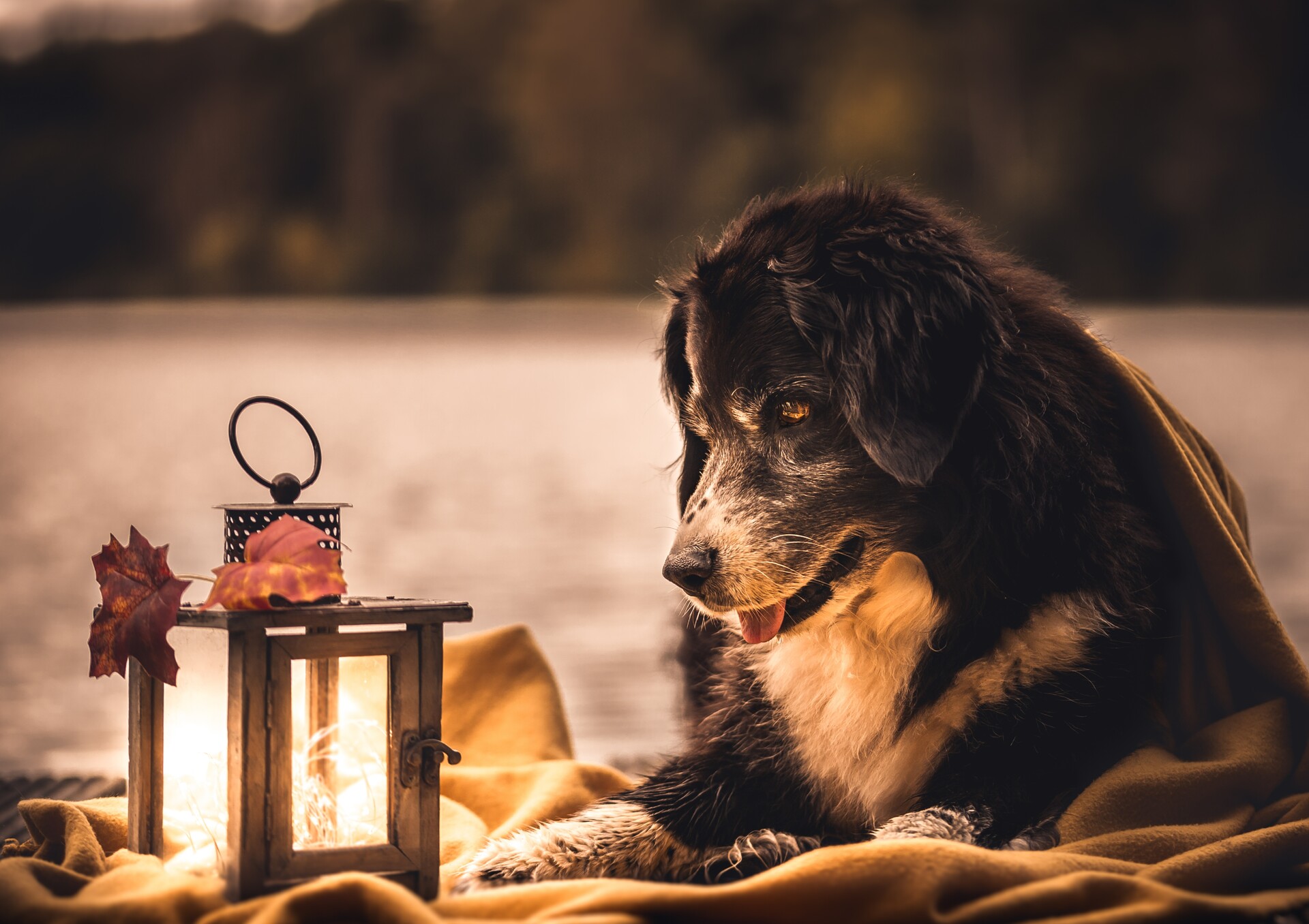
Congrats on this photo, Linda Luten!Our feedback: Pretty photo with pretty light. Technically, this photo is well executed. It’s great that the dog is looking at the lights. The focus was well set and the modest color palette works well. This photo would look great on the wall in a natural interior style filled with earthy colors and natural materials.

Congrats on this photo, Helena Zanting!Our feedback: This photo is very original, because of the well-chosen composition, the beautiful colors, great pastel shades in the background. We love how the little bug is waving at us. A unique and funny photo!
All winners are contacted via email. Thank you all for your wonderful submissions. And of course, congratulations to the winners. Would you like to join our next Photo Contest? The new contest’s theme is ‘Landscapes’. Send in your photo now and win! Join the Photo Contest >

